
Introduction
At this point, you’ve built your page content and set your site-wide structure. The next job is checking whether the site still works once the screen gets smaller. For most business sites, more than half of all visitors arrive on a phone, and a page that looks great at desktop width can feel cramped or misaligned on a small screen.
That’s what responsive review is for. You’re checking that the site is readable and usable on every screen size. Elementor has built-in responsive controls that let you preview and adjust the page at different screen sizes without leaving the editor.
Step 1 — Switch to Different Device Views
Elementor keeps the device controls in the top bar. The three icons next to the page title represent desktop, tablet, and mobile views.
Click the tablet icon. The canvas narrows to 1024px wide and shows how the page looks on tablet-sized screens. Click the mobile icon and it narrows again to 767px. Those are Elementor’s default breakpoints (the screen widths where the layout shifts to fit a smaller device). They match the way most real tablets and phones behave.
Switching the preview does two things at once. The canvas resizes so you can see the layout at that screen width, and the settings panel updates to show values for that specific breakpoint. Any edits you make while in mobile view only affect the mobile breakpoint. Your desktop values stay untouched.
How inherited values work
Elementor passes settings down from larger screens to smaller ones. If you set a heading to 36px on desktop, it stays 36px on tablet and mobile until you explicitly change it at a smaller screen size.
You can see the responsive controls in the settings panel. Fields with a small device icon support per-breakpoint values. If you haven’t set a value for the current breakpoint, Elementor keeps using the value inherited from the larger breakpoint until you override it.
This is why we suggest you work on desktop first before moving to smaller sizes. Desktop is the baseline that everything inherits from, so fix the biggest issues there before making targeted adjustments as the screen narrows.
Step 2 — Review the Page on Mobile
Click the mobile icon in the top bar. This is where the page will be under the most pressure for space. Long headings wrap awkwardly, buttons get crowded, and generous desktop padding can turn into wasted space.
Scroll through the full phone view. Look for these common issues:
- Headings that break into too many short lines. A heading that looked confident at desktop width can feel stuttery on a phone when it wraps every two or three words.
- Sections with too much padding. The generous vertical space that gave a section breathing room on desktop can look like an error on a 375px screen.
- Buttons that are hard to tap. A button that was fine on desktop might feel too small or too thin as a touch target.
- Side-by-side layouts that haven’t stacked. Two columns sitting next to each other on desktop might squeeze into unreadable slivers on mobile instead of stacking into a single column.
- Horizontal overflow. If anything causes a horizontal scrollbar on mobile, that’s the first thing to fix, because it makes the entire page feel broken.
Make a mental list of what needs changing, then work through the fixes in the next steps.
Step 3 — Fix Typography for Smaller Screens
Typography is usually the biggest responsive fix. A 48px hero heading that looks great on desktop can crowd an entire phone screen.
- Switch to mobile view using the top-bar icon.
- Click the heading you want to adjust.
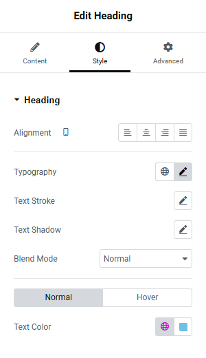
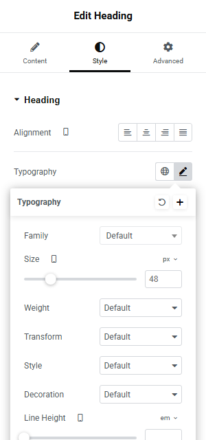
- Open the Style tab in the left panel.
- Click the pencil icon next to Typography to open the typography popover.
- Find the Size field. If you haven’t set a mobile-specific value, it still shows the desktop size. Type a smaller number to override it for mobile. For hero headings, something around 28px to 32px usually works. For section headings, 22px to 26px is a reasonable starting point.
The change applies only to the mobile breakpoint. Your desktop heading stays at the original size.
Check the result in the canvas immediately. If the heading still wraps too aggressively, try going a few pixels smaller. You’re looking for a size where the heading reads naturally without dominating the screen or breaking into too many lines.
Do the same for any subheadings or text blocks that look oversized on the phone preview. Body text usually inherits fine from desktop (16px reads well on most phones), but if any text feels uncomfortably large or small, adjust it the same way.
Step 4 — Tighten Padding and Spacing
Desktop sections often use generous padding to create breathing room. On mobile, that same padding can make sections feel empty or push content off-screen.
- Stay in mobile view.
- Click the container (the outer wrapper of the section you want to fix).
- Open the Advanced tab in the left panel.
- Scroll to the Layout section and find the Padding fields. The four boxes (Top, Right, Bottom, Left) might still show the desktop values.
- Reduce the top and bottom padding. If desktop uses 80px or 100px of vertical padding, try 30px to 40px on mobile.
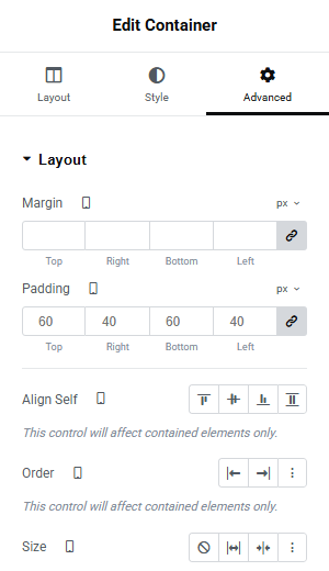
Left and right padding matters too. If text feels stuck to the edges of the screen, bump the horizontal padding up to 15px or 20px. If text feels too indented, bring it down.
Repeat this for each section that looks overspaced on the phone preview. The goal is sections that feel deliberate rather than either cramped or airy.
Buttons
While you’re adjusting spacing, check any buttons. If a button feels too thin or cramped to tap comfortably on a phone, select the Button widget, open its Advanced tab, and increase the padding on the mobile breakpoint.
A comfortable tap target is roughly 44px tall at minimum. Most Elementor buttons with default padding clear that, but a button with tight custom styling might not.
Step 5 — Stack Side-by-Side Layouts
Desktop layouts often place content side by side, such as an image on the left, text on the right. On mobile, those side-by-side layouts need to stack into a single column.
Elementor containers handle this through direction settings.
- Stay in mobile view.
- Click the container that holds the side-by-side layout.
- Open the Layout tab in the left panel.
- Find the Direction setting. On desktop it’s probably set to Row (horizontal). Change it to Column (vertical) for the mobile breakpoint.
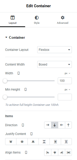
The child elements inside that container now stack vertically instead of sitting side by side. Check the canvas to make sure the stacking order looks right.
Sometimes the natural stacking order isn’t ideal. If you have an image on the left and text on the right at desktop, stacking them vertically puts the image first on mobile. That might be fine, or you might want the text first so visitors see the heading before scrolling to the image. If the order needs changing, adjust it through the Order setting on the individual child elements within the container’s layout controls.
Feature grids, image-and-text sections, paired columns, and card layouts can all benefit from the same Row-to-Column change.
Step 6 — Hide Elements That Don’t Help on Mobile
Some elements earn their place on desktop but add clutter on a phone. It might be a decorative divider between sections, a secondary call-to-action button, a large background pattern, or an icon set that looks neat in a wide layout but just takes up vertical space on mobile.
Elementor lets you hide individual elements by device size.
- Select the element you want to hide on mobile.
- Open the Advanced tab.
- Scroll down to the Responsive section.
- Find the Hide On Mobile Portrait toggle and switch it on. Do the same for Hide On Tablet Portrait if the element should also disappear on tablets.
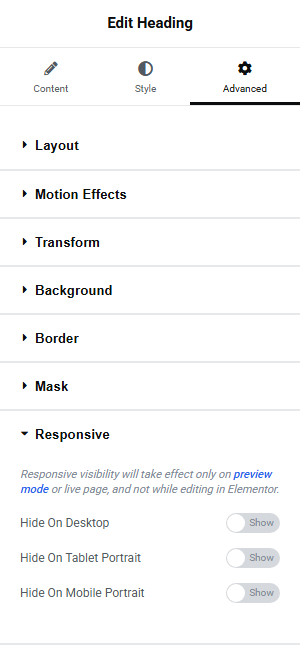
The element disappears from the phone preview but stays visible on desktop. Visitors on larger screens still see it, while phone visitors get a cleaner experience.
Use this sparingly. If you find yourself hiding a lot of elements on mobile, the desktop design might be busier than it needs to be. Strong pages have roughly the same content structure across all screen sizes, with layout and sizing adjusted rather than whole chunks removed.
Step 7 — Check the Header and Footer on Mobile
Responsive review covers the whole site, not just the page body. The header and footer need the same attention.
In the mobile preview, look at the top of the page. The Astra theme should have replaced the desktop navigation with a hamburger menu icon (the three-line toggle). Click it in the preview and check that the slide-in menu opens cleanly, that the menu items are readable, and that they’re large enough to tap without accidentally hitting the wrong link.
Then scroll to the bottom and check the footer. Copyright text, footer links, and any contact details should still feel tidy on a phone. If the footer feels cramped or the text wraps badly, those adjustments happen in Astra’s Customizer rather than in Elementor. Same for the mobile menu. If the toggle icon or slide-in panel feels off, go to Appearance → Customize → Header and adjust the Off-Canvas Menu settings there.
Step 8 — Test in a Real Browser
Elementor’s responsive preview is useful, but it’s still a simulation. Before you call the page done, test it outside the editor.
- Click Preview in Elementor’s top bar (the eye icon), or publish the page and visit it directly.
- Open the page in your phone’s browser. If you’re working on a local or staging URL that your phone can’t reach, use your desktop browser’s built-in device mode instead (right-click → Inspect, then click the device toggle icon).
- Scroll the entire page on the phone or phone-sized view.
- Open the mobile menu and tap a few links.
- Tap the main call-to-action button.
- Check the footer.
Browser testing catches things the Elementor preview sometimes misses. Touch scrolling feels different than mouse scrolling, for example, and font rendering varies between devices.
You don’t need to test on ten devices. One real phone and one resized desktop browser will catch almost everything. Pay particular attention to any interactive elements like forms or accordions, because those sometimes behave differently with touch input than they do with a mouse cursor. If those basics work and nothing feels broken, your site is ahead of a lot of first launches.
Conclusion
Responsive design can become an endless loop if you let it. You fix a heading on mobile, notice the padding looks off, adjust that, realize the tablet view shifted. Focus on getting readable headings, tappable buttons, a working menu, and no horizontal scrollbar. Once those check out across desktop, tablet, and mobile, you’re mostly done.
Pixel-perfect consistency across every possible screen size is a luxury. A clean, working site that’s actually published beats a perfect draft sitting in the editor.
The responsive workflow itself is worth keeping in your back pocket. Every time you build or update a page, the same sequence applies: check each screen size, fix typography, then spacing, then stacking, then the header and footer, and finish with a real-browser test. It gets faster each time you do it.
The next tutorials shift from design into performance, starting with the speed improvements that make the biggest difference for your visitors.
Next steps: