
Introduction
With Elementor installed and configured from Part 9, the builder is ready to use.
You learn Elementor best by building one real section and seeing what each control changes, before repeating that logic as the page grows. This tutorial walks through the editor and gets you from an empty page to a homepage section that’s already close to publishable.
Step 1 — Opening the Editor
- In your WordPress dashboard, go to Pages → Add New Page.
- Give the page a real title such as “Home” or “Services”.
- Click Edit with Elementor.
The page reloads into Elementor’s visual editor.
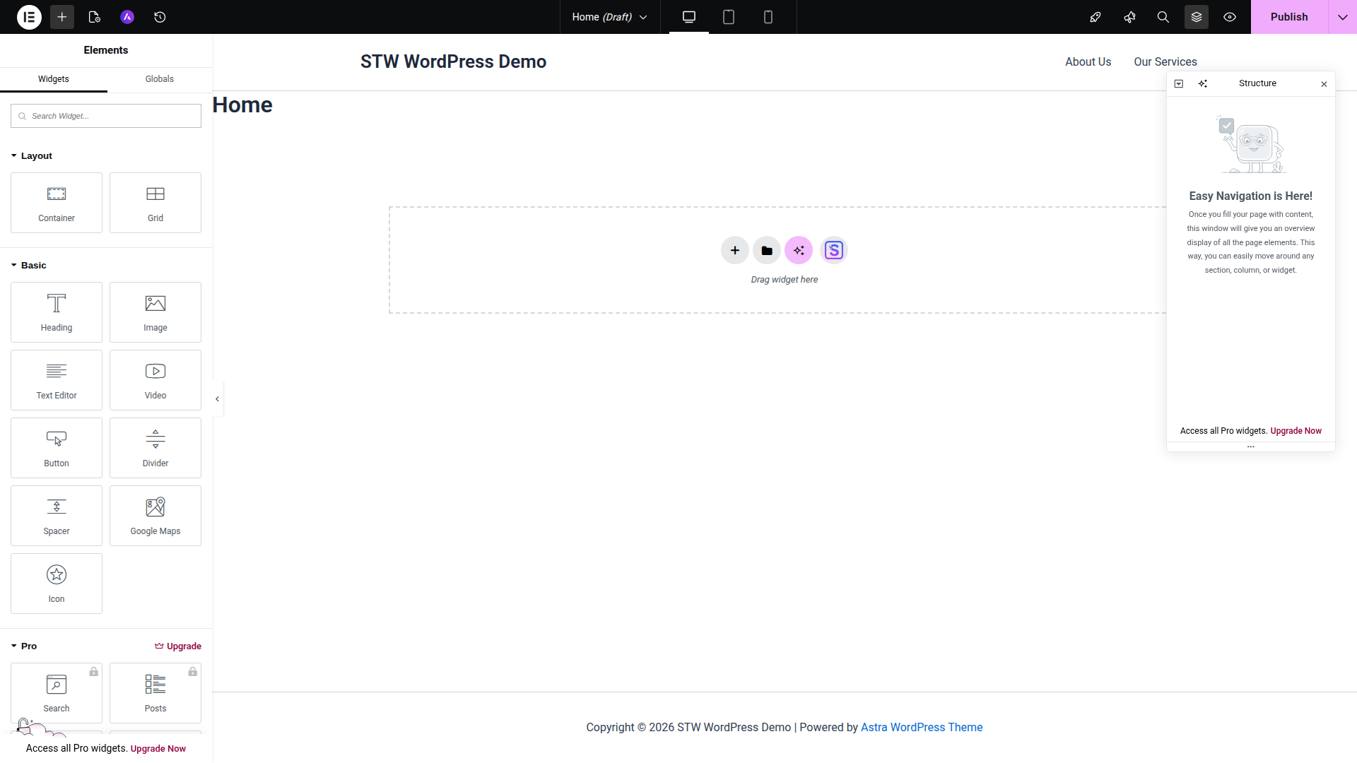
What you’re looking at
- The top bar holds the controls you’ll use constantly. The device icons switch between desktop, tablet, and mobile previews. The Structure button opens a tree view of the page. The Publish button saves the result.
- The left panel is where you either add widgets or edit the selected element. When nothing is selected, it shows the widget library. When you click a heading, button, or container, the panel changes to that element’s settings.
- The canvas in the middle is the live page preview. Instead of editing a backend form and hoping the front end looks right, you’re working on the actual page while looking at it.
Older Elementor tutorials often talk about the Navigator panel. Current versions of Elementor label that panel Structure.
Step 2 — Start with One Real Homepage Section
In Elementor, most page layouts are built from repeatable sections (hero, features, testimonials, etc), each wrapped in a container.
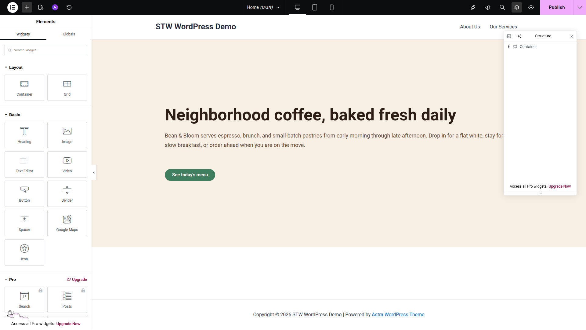
We can demonstrate with a simple hero section with a heading, a short paragraph, and one button.
Add the container
Click the + button in the canvas and choose a Container. For a first hero section, keep it simple and use a single container.
Think of the container as the section wrapper. It controls the width, padding, spacing, and background for everything inside it.
Add the content
With the container selected, add these three widgets in order.
- Heading
- Text Editor
- Button
That one section covers the three decisions you’ll keep repeating across the rest of the page.
- Content. What belongs in the section
- Structure. How the section is spaced and aligned
- Action. What the visitor should do next
Use the Container Controls Before Styling Every Widget
Beginners often style each widget one by one and only later notice that the whole section still feels unbalanced. Elementor works better when you start at the container level.
Select the outer container and look at these controls first:
- Content Width. This decides how wide the content can run. For most business pages, boxed content is easier to read than edge-to-edge text.
- Min Height. This gives the section enough vertical space to feel deliberate.
- Padding. Padding creates breathing room inside the section. If a heading looks stuck to the edges, the problem is usually padding.
- Gap. Gap controls the spacing between the elements. It’s better than dropping Spacer widgets everywhere.
- Justify Content and Align Items. These control where the content sits inside the section. A centered hero and a left-aligned hero can both work.
Once the container feels right, then move on to the heading, text, and button styles.
A Few Habits That Save Time Later
Once you move beyond the first hero, a couple of habits make Elementor much easier to manage.
Use Gap for the space between items that belong to the same container. It’s best to change widget margins only when one item needs to break the pattern. Pages built mostly with random margins are much harder to tidy later.
Let containers handle layout and let widgets handle content. If a section feels too wide, too cramped, or badly aligned, check the container before you start tweaking the heading or button. The outer structure usually causes the problem.
Also check the page layout itself if the canvas feels boxed in or unexpectedly narrow. Astra’s page settings and Elementor’s own page settings can both affect the available width.
Step 3 — Set Your Global Colors and Fonts Early
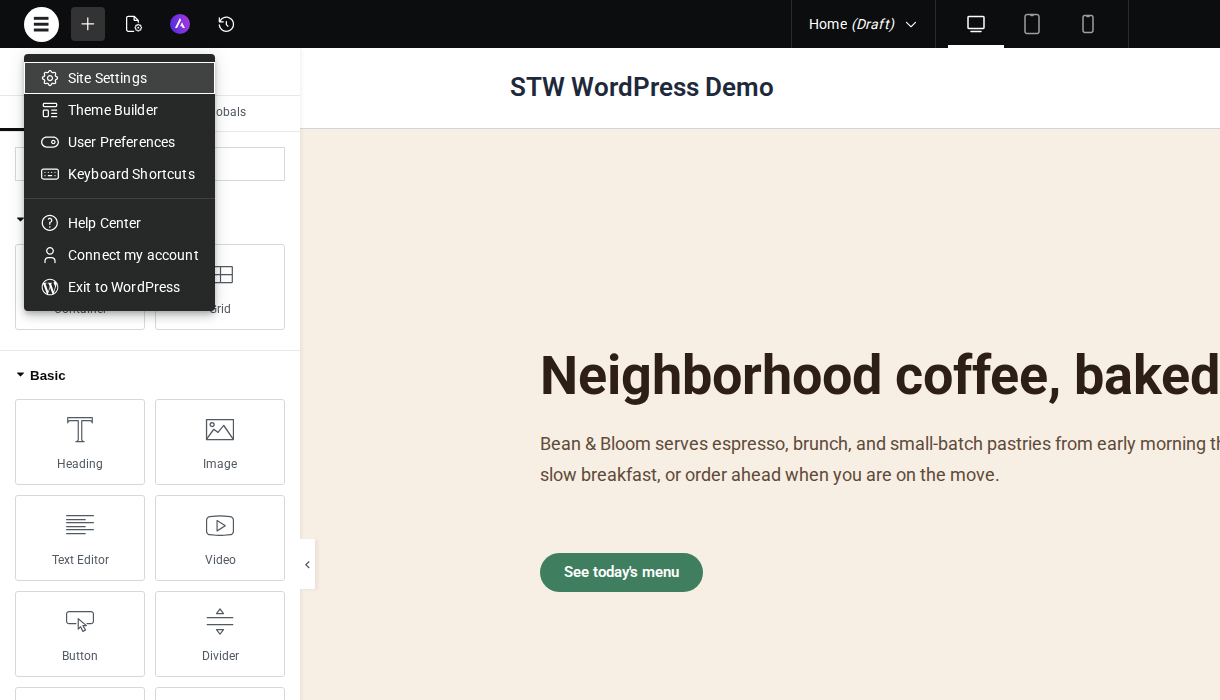
After the first section looks about right, click the round Elementor logo in the top-left corner and open Site Settings from that menu. Global settings are where one-off design choices turn into a consistent page system.
- Global Colors let you define your main palette once. A cafe page might use a cream background, a dark espresso text color, and one muted green accent for buttons, for example.
- Global Fonts do the same for typography. Pick one heading font and one body font and stick to them. The page immediately looks more coherent when every section draws from the same small set of choices.
Consistent fonts and colors do more work than decorative effects.
Once those basics are in place, you can start being selective about where you add more visual weight.
Step 4 — Build the Page in Visible Steps
Once the hero exists, the next sensible additions are other business-site basics, such as:
- a short story or intro section
- a simple feature grid
- a testimonial or review block
- a final call to action
Add one section, check spacing and width, then move to the next.
Elementor makes it tempting to skip ahead and start browsing animations, shape dividers, and extra widgets before the page skeleton is stable. Resist that temptation. A plain page with solid hierarchy and spacing beats an overbuilt page every time, and then you can add the fun stuff on top of a strong foundation.
Where Templates Fit
Templates and website kits are useful when you want a faster starting design. They’re not mandatory, and they’re not a replacement for understanding the editor.
If you import a template, use it as a starting point, not as a finished design. Replace the text, replace the images, check the spacing, and remove anything that adds weight without helping the site.
What to Ignore for Now
Elementor offers a huge widget library, plus many Pro widgets and third-party add-ons. That can make it feel like a good page comes from adding more things.
It doesn’t.
For a first publishable page, you can do a surprising amount with a short list of widgets.
- Heading
- Text Editor
- Button
- Image
- Divider
- Icon
- Container
If you reach for sliders, counters, flip boxes, floating buttons, and animation before the page already works without them, the page usually gets worse.
Step 5 — Revision History Is Your Safety Net
Elementor tracks every change you make while editing. If you accidentally delete a section or make a spacing change that wrecks the layout, you can step back without starting over.
Click the History icon in the top bar (the clock icon next to the responsive-device toggles) to open the History panel.
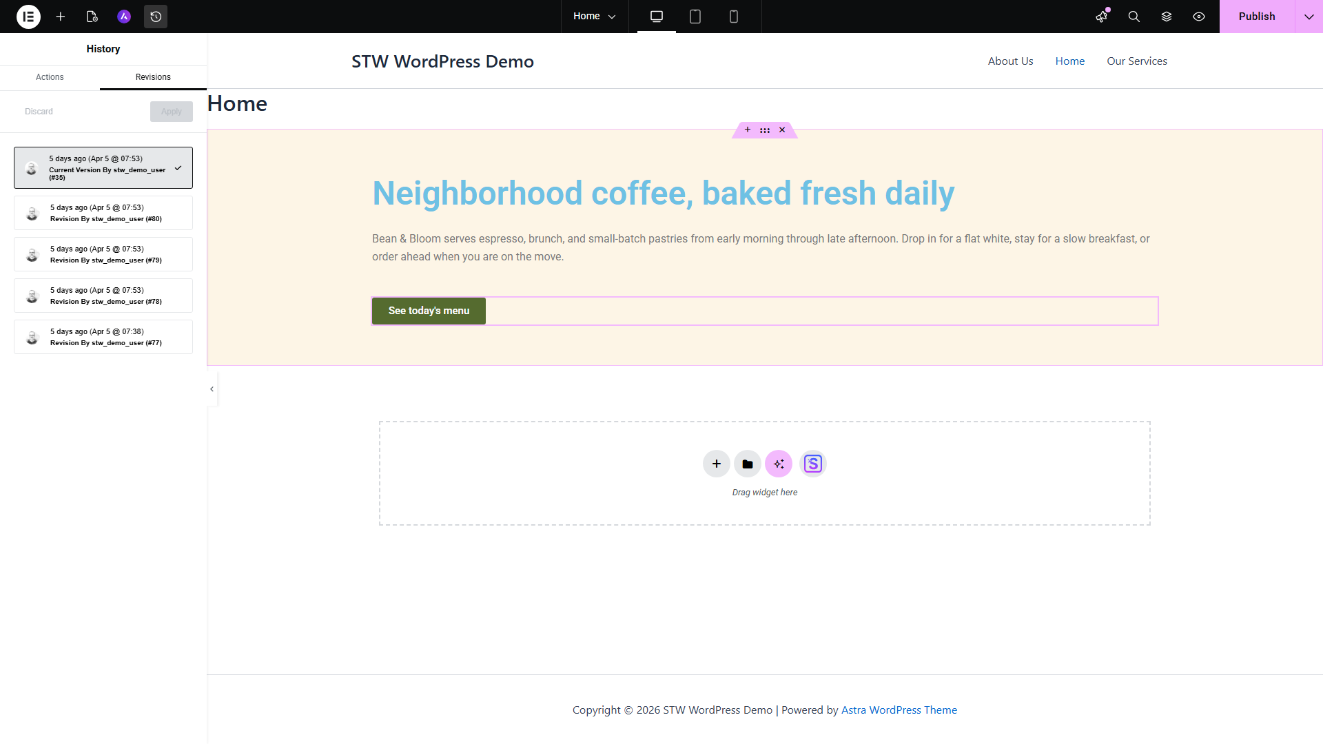
The panel has two tabs.
- Actions lists every individual edit you’ve made during the current session. Click any action in the list and the page jumps back to how it looked at that point. This is granular undo, more targeted than Ctrl+Z because you can see what each step actually changed.
- Revisions lists every version of the page that was saved or published. Each revision is timestamped and tied to the user who saved it. Click a revision to preview it, then click Apply to restore that version or Discard to go back to the current page.
The Actions list clears when you leave the editor. Revisions stay in the database across sessions, so you can come back days later and still roll a page back to an earlier state.
Save often to build better revision points
Every time you hit Save Draft or Publish, WordPress stores a new revision. If you build half a page and then make a series of changes you’re not sure about, save first. That bookmark gives you a clean point to return to if the experiment doesn’t work out.
Conclusion
The Elementor editor should be much less daunting now you’ve built one real section and watched the page improve through small, visible changes.
The next article moves from page content to the parts visitors see on every page. Part 11 covers the site-wide structure around your Elementor content, including how Astra and Elementor split that work on a real first-site setup.
Next steps: