
Introduction
You can set up page caching, enable Redis object caching, and choose a lightweight theme, then undo a lot of that work by uploading a 4 MB photo as your hero image.
Images are usually the heaviest thing on a WordPress page. A single unoptimized smartphone photo can weigh more than your entire page’s HTML, CSS, and JavaScript combined. Multiply that across a services page with six images, a portfolio with twenty, or a blog post with featured images, and your site is hauling serious weight on every load.
Image optimization is also one of the easiest performance wins available, and most of it happens before you even open WordPress. We’ll start with the pre-upload habits that keep images fast, then move into AccelerateWP’s media settings for server-side optimization on STW WordPress hosting.
Why Images Are the Problem
A modern smartphone camera produces photos that are 4,000-6,000 pixels wide and 3-8 MB in file size, which is appropriate for printing a poster but wildly oversized for a webpage.
Your site’s content area is typically 1,200 pixels wide at most. A full-width hero image might need 1,920 pixels. Nothing on your site needs a 6,000-pixel image. But if you upload one without resizing, WordPress stores the original and generates several smaller versions automatically. The original still gets served in some contexts, and even the generated sizes may be larger than necessary.
Beyond dimensions, there’s compression. A JPEG straight from a camera is often minimally compressed to preserve editing flexibility. For web display, you can compress it substantially further without visible quality loss. The difference between “looks perfect on screen” and “looks perfect on screen at half the file size” is just a little tweak of compression settings.
And then there’s format. JPEG has been the web’s default for decades, but newer formats like WebP deliver the same visual quality at much smaller file sizes. Most browsers have supported WebP for years.
Fixing these three things before upload is the single most effective image optimization you can do.
The Pre-Upload Workflow
Get into this habit before adding any image to WordPress.
Step 1 — Resize images for web
Before touching compression or format, resize the image to the maximum width it’ll be displayed at.
| Use case | Recommended width |
|---|---|
| Hero/banner image (full-width) | 1,920 px |
| Blog post featured image | 1,200 px |
| In-content image (within text column) | 800-1,000 px |
| Thumbnail or card image | 400-600 px |
| Logo | Usually under 300 px |
These aren’t rigid rules. The point is to know roughly how wide the image will appear on screen and size it accordingly. A 1,200 px blog image doesn’t need to be delivered at 4,000 px.
Most image editing tools handle this. Photoshop, GIMP, Affinity Photo, and even the built-in photo apps on Windows and macOS can all resize an image in seconds. Open it, resize to the target width while maintaining aspect ratio, and save.
Step 2 — Compress the image
Compression reduces file size by discarding visual information that humans can’t easily see. For photographs, lossy compression at quality 80-85% is the sweet spot. The file shrinks dramatically and the difference is invisible at screen resolution.
Free tools that do this well:
- Squoosh is Google’s browser-based tool. Drag an image in, adjust quality, compare before and after, and download. Handles JPEG, PNG, WebP, and AVIF.
- TinyPNG takes drag-and-drop compression for PNG and JPEG. Simple and effective.
- GIMP or Affinity Photo give full control over export quality settings.
If you’re processing many images at once, desktop tools like ImageOptim (macOS) or FileOptimizer (Windows) can batch-compress an entire folder.
Step 3 — Choose the right format
| Format | Best for | Why |
|---|---|---|
| WebP | Most web images | Smaller files than JPEG at equivalent quality. Supported by all modern browsers. |
| JPEG | Photographs when broad compatibility matters | Universal support. Still a safe fallback. |
| PNG | Graphics with transparency, logos, text overlays | Lossless. Larger files than WebP, but necessary for sharp edges or transparency. |
| SVG | Logos, icons, simple illustrations | Vector format. Scales to any size without quality loss. Tiny file sizes for simple shapes. |
| AVIF | Maximum compression for supported browsers | Even smaller than WebP. Browser support is good and growing. |
For most WordPress sites, WebP is the practical default. If you’re using Squoosh, export as WebP at quality 80. The file will typically be 30-50% smaller than the equivalent JPEG.
A complete example
You have a photo from your phone at 4,032 x 3,024 pixels, 5.2 MB:
- Resize to 1,200 px wide (for a blog post). The file drops to roughly 1.5 MB.
- Export as WebP at quality 80 in Squoosh. The file drops to roughly 80-150 KB.
- Upload to WordPress.
That’s a 97% reduction from 5.2 MB to under 150 KB, and the image looks identical on screen.
Naming Your Image Files
While you’re preparing images, rename them. IMG_8847.jpg tells search engines nothing. handmade-ceramic-vases-oslo.webp tells them what the image shows.
Use lowercase, separate words with hyphens, and describe what the image depicts. Keep it concise but specific. This helps with image search visibility and makes your media library easier to manage as it grows.
Alt Text
Every image you upload to WordPress should have alt text. It serves two purposes:
- Accessibility. Screen readers read alt text aloud to visitors who can’t see the image. Without it, those visitors get nothing useful from the image.
- SEO. Search engines use alt text to understand what an image shows. It contributes to your image search visibility.
Write alt text that describes the image’s content rather than its function. Set alt text when you upload the image in the WordPress media library, or when you insert it into a page or post. The alt text field appears in the attachment details panel on the right side of the media uploader.
What WordPress Does After Upload
When you upload an image, WordPress generates multiple sizes automatically. It creates a thumbnail, medium, large, and full-size version. Your theme and plugins may register additional sizes on top of those.
WordPress uses the srcset attribute in your page’s HTML to let the browser choose the most appropriate size for the visitor’s screen. A phone might get the 600 px version while a desktop gets the 1,200 px version. This is built-in and works without configuration.
Your pre-upload work makes this system more effective. If you upload a properly sized and compressed image, every generated version inherits that quality. If you upload an uncompressed 6,000 px original, every generated version comes from unnecessary excess.
AccelerateWP Media Settings on STW WordPress Hosting
STW’s WordPress hosting plans include AccelerateWP, which has a dedicated Media page with settings for lazy loading, image dimensions, fonts, and server-side image optimization.
Go to AccelerateWP → Media in the WordPress admin sidebar.
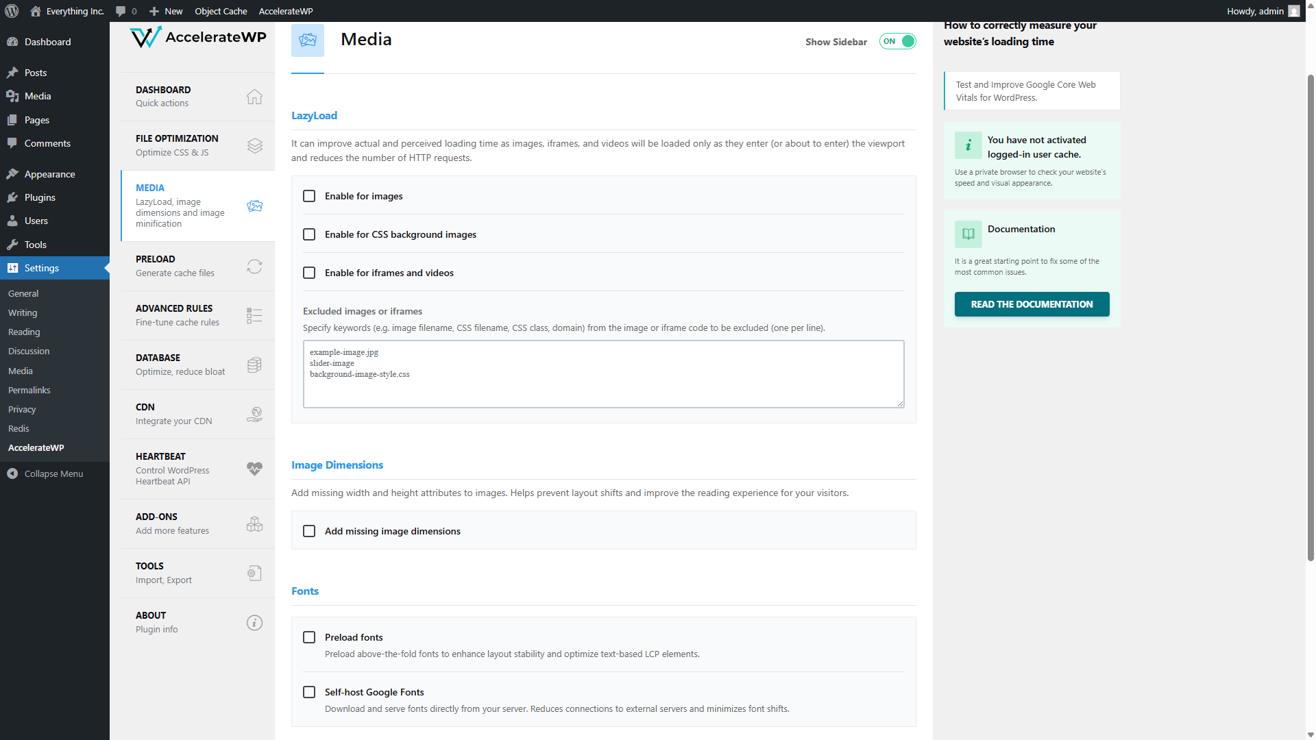
LazyLoad
Lazy loading delays the loading of images, CSS background images, and iframes until they’re about to enter the visitor’s viewport. Instead of loading every image on the page when it first opens, the browser only loads images as the visitor scrolls toward them.
Three checkboxes control this:
- Enable for images applies lazy loading to standard
<img>tags - Enable for CSS background images covers images set through CSS (hero sections, decorative backgrounds)
- Enable for iframes and videos defers embedded videos and iframes until they’re visible
All three are unchecked by default. For most sites, enabling lazy loading for images is worth doing. It reduces initial page weight and improves Largest Contentful Paint scores, especially on pages with many images below the fold.
The Excluded images or iframes field lets you specify images that should always load immediately. If your above-the-fold hero image gets lazy-loaded by mistake (causing it to appear blank briefly on load), add its filename or CSS class to this exclusion list.
Image Dimensions
The Add missing image dimensions checkbox adds width and height attributes to images in your HTML that are missing them. Without these attributes, the browser doesn’t know how much space an image needs until it finishes loading. This causes layout shifts, where content jumps around as images pop in.
Enabling this helps your Cumulative Layout Shift (CLS) score, which is one of Google’s Core Web Vitals. It’s a safe setting to enable on most sites.
Fonts
Two font-related settings appear here:
- Preload fonts tells the browser to start downloading your above-the-fold fonts immediately, before it discovers them in the CSS. This can reduce text rendering delays.
- Self-host Google Fonts downloads Google Fonts and serves them from your own server instead of fetching them from Google’s CDN. This reduces external connections and avoids potential privacy concerns with third-party font loading. If your theme uses Google Fonts, this is worth enabling.
Image Optimization
At the bottom of the page, the Enable image optimization checkbox controls server-side image compression and format conversion. We showed you how to enable this in part 13.
AccelerateWP automatically compresses images on the server and serves next-generation formats (like WebP) when possible. The note below it says “To disable this feature, use AccelerateWP UI in hosting control panel,” which means it’s managed at the server level.
This server-side optimization is a safety net. It catches images that were uploaded without pre-upload optimization and improves them automatically. Pre-upload optimization still gives you more control over quality settings, but having this enabled means nothing slips through completely unoptimized.
If You’re on Shared Hosting
If you don’t plan to use AccelerateWP, two plugin options can help:
- ShortPixel (free tier available) compresses images on upload and can bulk-optimize existing images. It supports WebP conversion and offers lossy and lossless compression modes.
- Imagify (free tier available) works similarly, with automatic compression on upload and bulk optimization for existing images. It integrates with WP Rocket if you’re using that caching plugin.
Both work by sending your images to an external compression service and replacing the originals with optimized versions. The free tiers handle a reasonable number of images per month.
The pre-upload habits from earlier in this article still apply. Plugin-based optimization improves what you upload, but uploading a properly sized WebP at quality 80 gives you a better starting point than uploading a 6,000 px JPEG and hoping a plugin fixes it.
Conclusion
Image optimization is the closest thing to free performance you’ll find. The work happens before you open WordPress. Resize to the width you need, compress at a sensible quality level, export as WebP, name the file descriptively, and add alt text after upload. A five-minute habit per image can save seconds of load time per page.
On STW WordPress hosting, AccelerateWP adds a server-side safety net with automatic image optimization and lazy loading controls. On shared hosting, plugins like ShortPixel or Imagify fill the same role.
The next tutorial covers the last major source of page weight — CSS and JavaScript files.
Next steps: